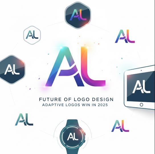
Logo design is changing with digital trends. Today, businesses need logos that adapt to different devices, platforms, and screen sizes. Minimalist adaptive logos are becoming the standard because they are flexible, modern, and easy to recognize everywhere. Why Adaptive Logos Matter A single static logo does not work well across all platforms. From websites to mobile apps to social media icons, a logo must resize and adjust without losing its identity. Adaptive logos solve this problem by staying clear and consistent at any scale. Minimalism as the Core Minimalist design removes unnecessary details and focuses on strong shapes, colors, and typography. This makes logos easier to remember, faster to load, and more professional looking. Practical Benefits Works across small screens and large displays Improves brand recognition in crowded markets Faster to adapt into digital products and marketing materials Fits perfectly into mobile apps, favicons, and profile pictures Best Practices for 2025 Use simple geometric shapes Limit color palettes to 2 or 3 strong tones Test readability at very small sizes Create a flexible system, not just one logo file Example A brand can use a full detailed logo for a website header, a simplified symbol for social media, and a single-letter mark as a favicon. All three connect back to the same brand identity. Conclusion Minimalist adaptive logos are no longer a trend. They are a requirement for modern branding in 2025. Businesses that update their logos to follow this approach will stand out, remain consistent, and look future ready.
Future of Logo Design: Why Minimalist Adaptive Logos Win in 2025